B for Bread
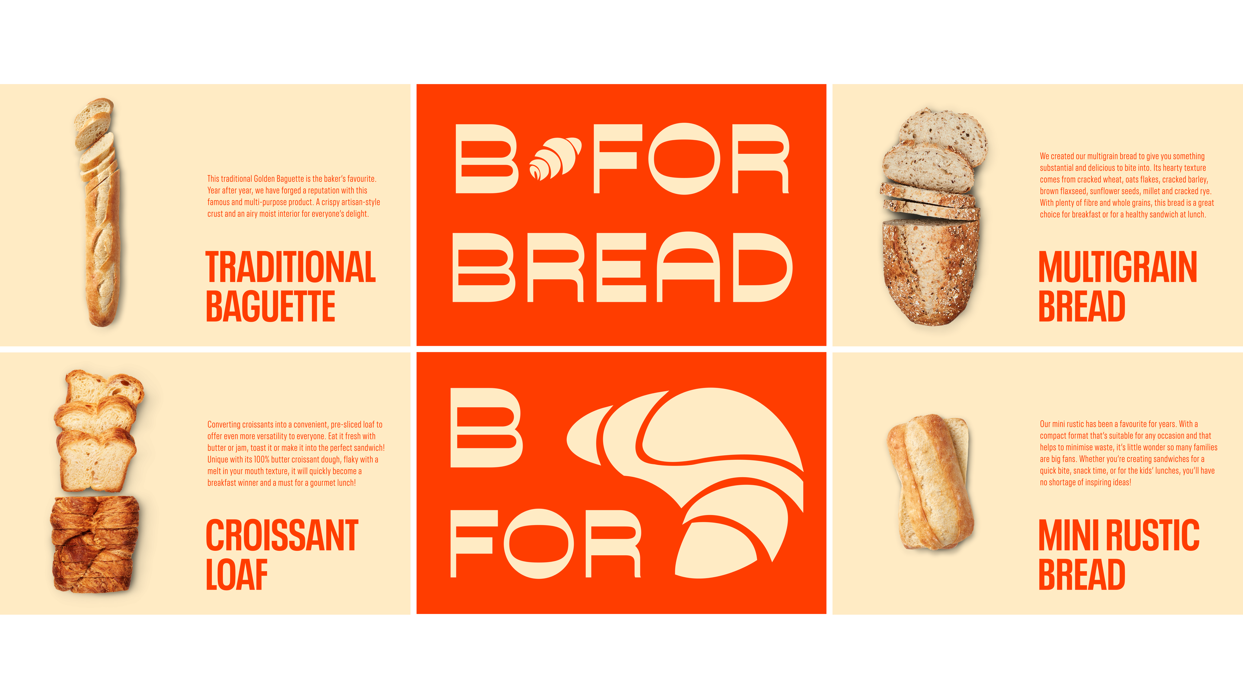
The concept of "B for Bread" focused on simplicity, tradition, and community. The logo design reflects the handmade nature of bread-making with a minimalist approach, highlighting quality ingredients and artisanal craftsmanship. The bright warm reds and beige colours symbolise warmth and comfort, evoking the cozy feeling of a kitchen filled with the scent of freshly baked bread. The bold font exudes strength and confidence, while the clean lines and modern design add sophistication. Through branding elements like packaging and marketing materials, "B for Bread" aims to connect with consumers on a deeper level and establish itself as a trusted and beloved source of delicious, homemade bread.